Natural Areas Conservancy
A brand refresh for a NYC-based nature organization's brand and website.
Overview
The Natural Areas Conservancy is a well-established nonprofit that partners with NYC Parks to maintain, study, and share natural areas in and around NYC.
Goals
- Expanding an existing brand into a more appealing and user-friendly website to help staff easily make the updates.
- Utilizing a visually appealing website to engage users, foster connections, and drive increased traffic for the organization.
Tools
Sketch / Figma / Illustrator / InVision / After Effect
Methods
Website Audit / Wireframes / Visual Design / Icon Design / Brand Reposition / Quality Assurance / Usability Testing
Teams
UI / UX Designer Me
UX Designer Phebe Pierson
Design Director Bruce Viemeister
Content Strategy Mingwei Ma
Duration
5 months
View Live Site
01 Context
Problems
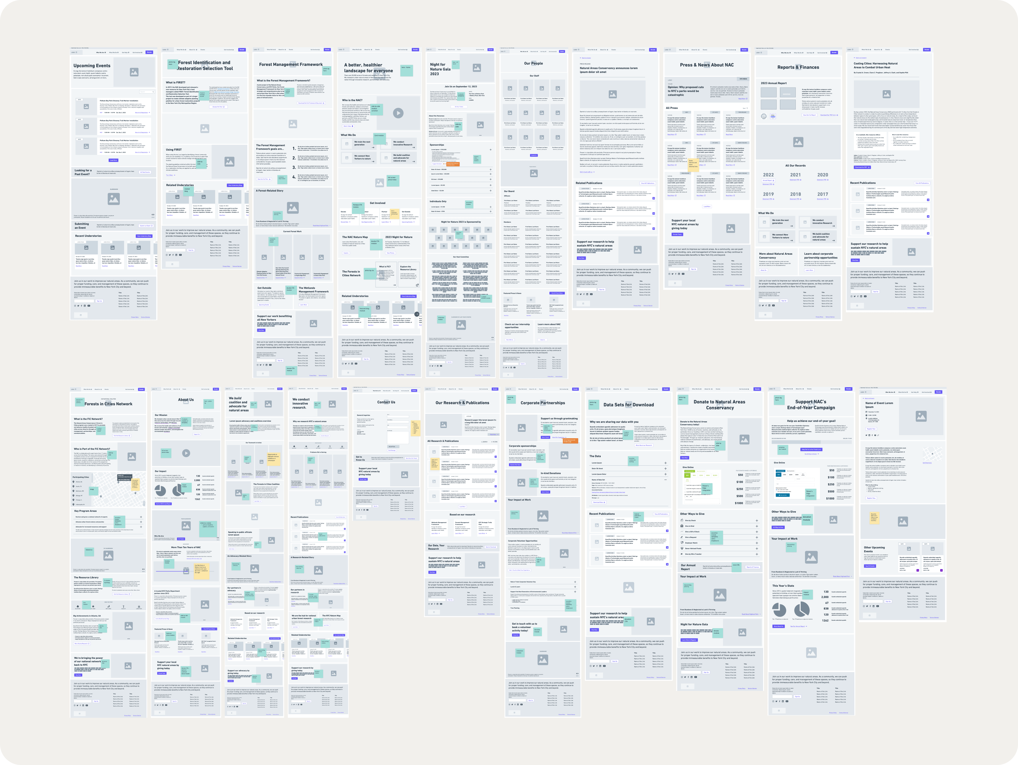
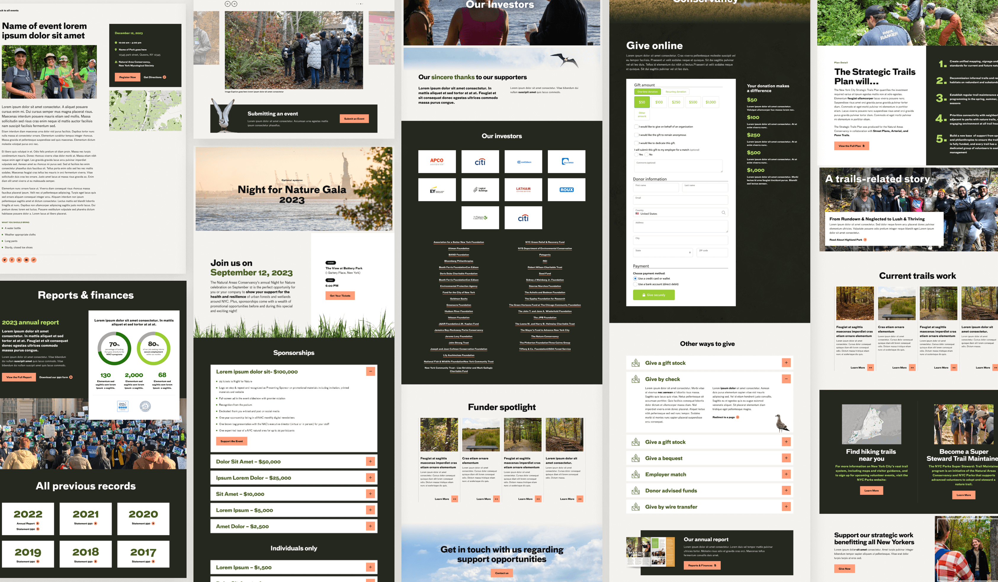
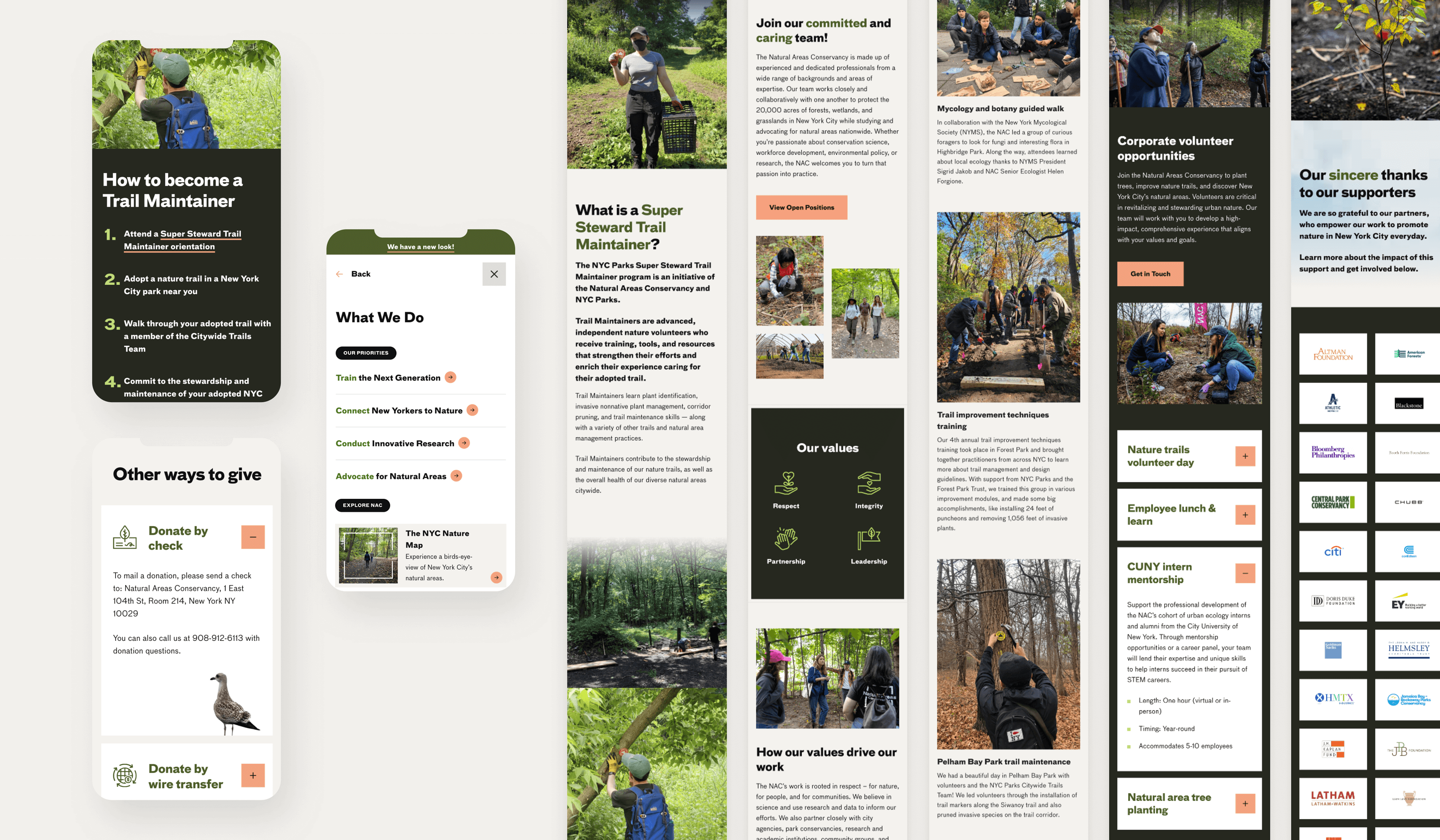
Beginning with discovery and UX design, we understand the organization and their requirements. To develop user-friendly websites for staff, we initiated the creation of a new modular system, enabling them to utilize the website efficiently and construct new pages seamlessly in the future.
02 Accessibility
Usability and accessibility first
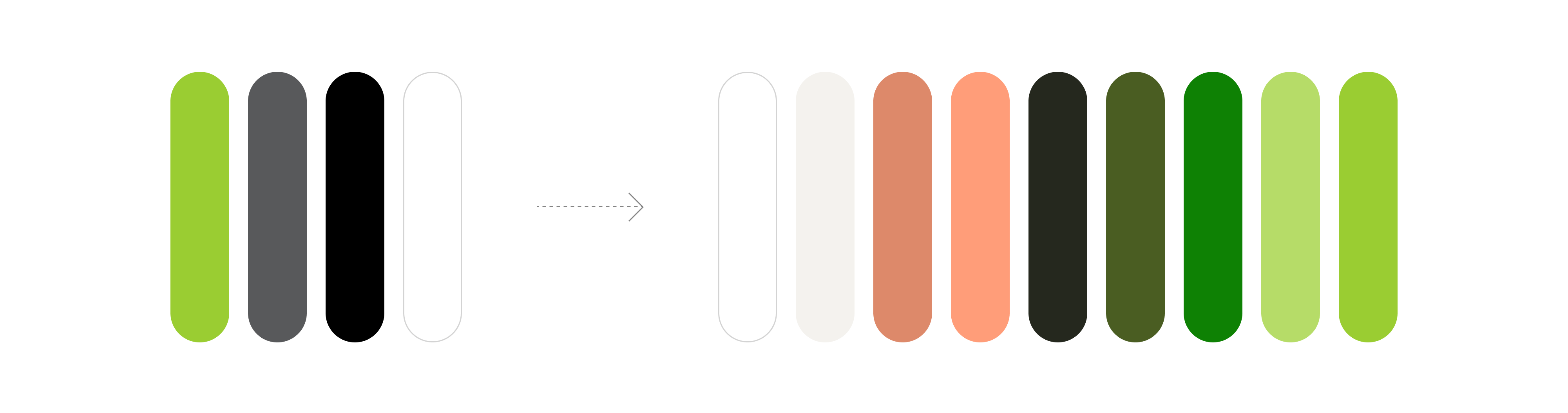
Color Palette
We first received NAC’s brand guideline and immediately notice the color will not pass the accessibility compliance. We added variety of greens and carol color, and importantly changed the pure black into a more accessible dark color.
03 Brand
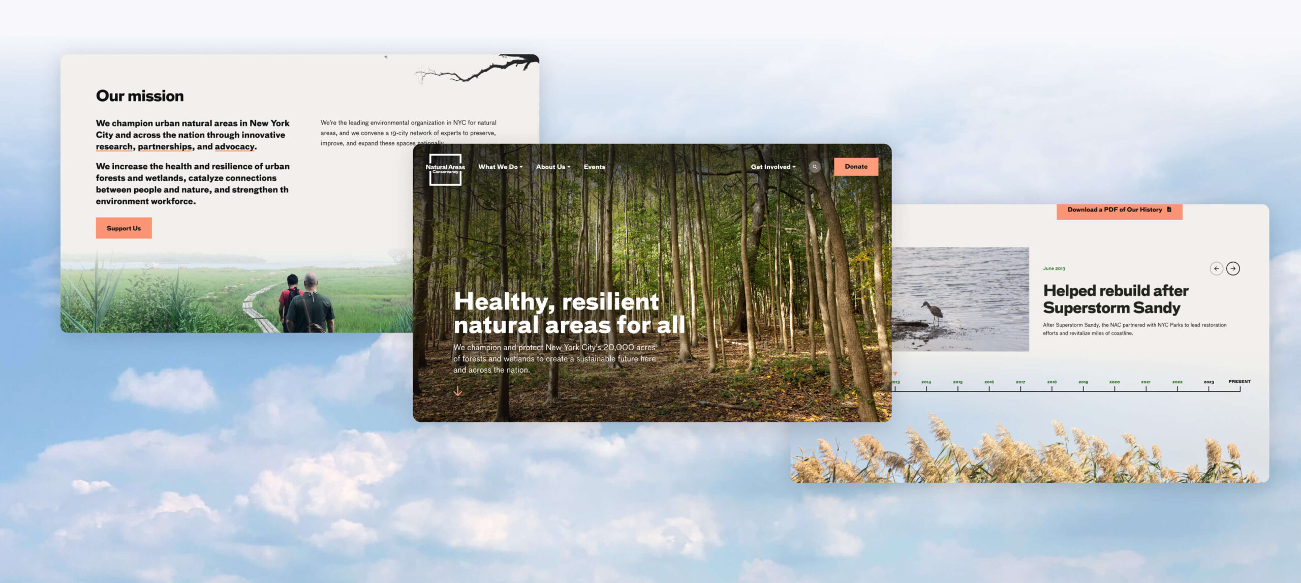
Extending the visual language from the existing brand guide, and leveraging photography to elevate the brand.
Visual Direction
Extending the brand
We introduced new colors to complement the existing palette, and it add the dynamism and depth to the brand.
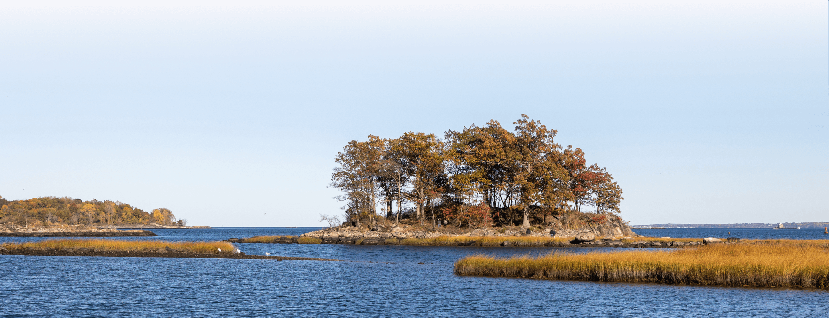
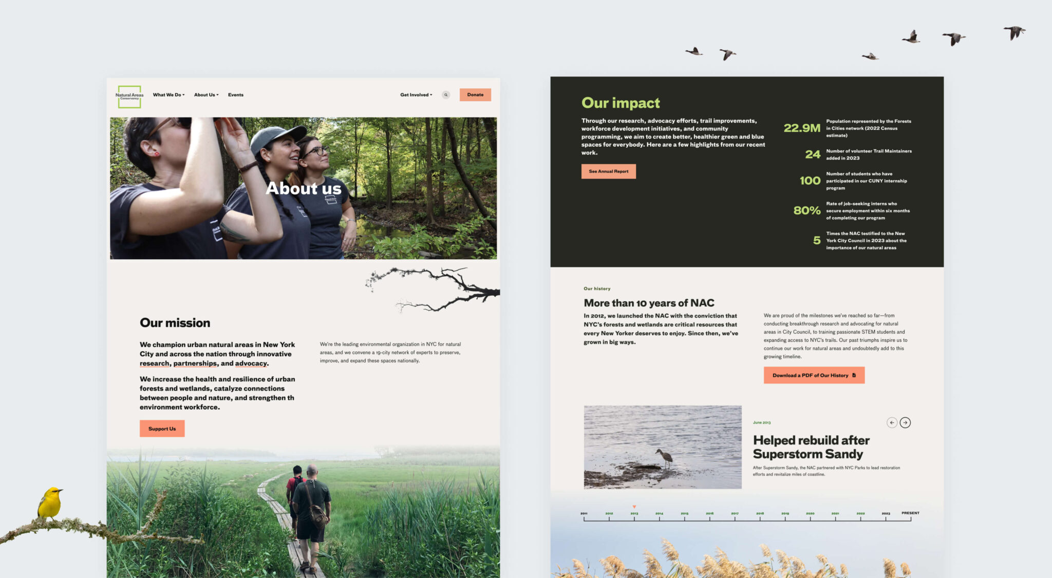
Using the photography to show the nature
We found that the NAC team had many photo assets available for the website. However, our challenge is how to show the nature on a 2D web page with photography that bring the audience directly to the nature. Our solution involved using cutout silhouettes and gradients to create layers.
Results and takeaway
2X
Traffic
22%
Decrease in bounce rates
A user first marketing website for everyone
Besides helping the audience navigate easily, the user-friendly website is crucial for building modular websites. This makes it easier for staff to keep the site up-to-date with the latest information.
The legibility of text overlaid on top of photos is limited
The use of large fonts on photos will complicate the QA process. We'll need to ensure that all photos and text are aligned properly and remain legible across different viewpoints.