Girl Be Heard
Website redesign for a gender justice performing arts organization
Overview
We partnered with the team at Girl Be Heard to rebrand the organization and create a fresh, fun new modular website that matches their joyful, confident, and progressive DNA.
Goals
- We aim for their target audience to navigate the website, sign up for programs, and be inspired to become donors upon seeing their achievements.
- Our goal is to create an organized archive page for storing expired events and blog posts.
- Seeking a fresh brand upgrade, including a new brand font that embodies their identity.
Tools
Sketch / Illustrator / InVision
Skills
Visual Design / Icon Design / Branding / Quality Assurance / Usability Testing
Teams
UI / UX Designer Me
UX Lead Tamara Olson
Design Director Bruce Viemeister
Duration
4 months
View Live Site
01 UX Phase
Match the youthful energy of the webpage to resonate with users.
Target Audience
We have diverse audiences and users for this site. In addition to making it easy for staff to use, it should also be informative and engaging for students and inspiring for funders.

Students and their family who are interested to the program and the events. Also need to apply the fun and energy to attract students to join.

Funders who appreciate the foundation's work and see the impact it's making, and consequently make donations and contributions.
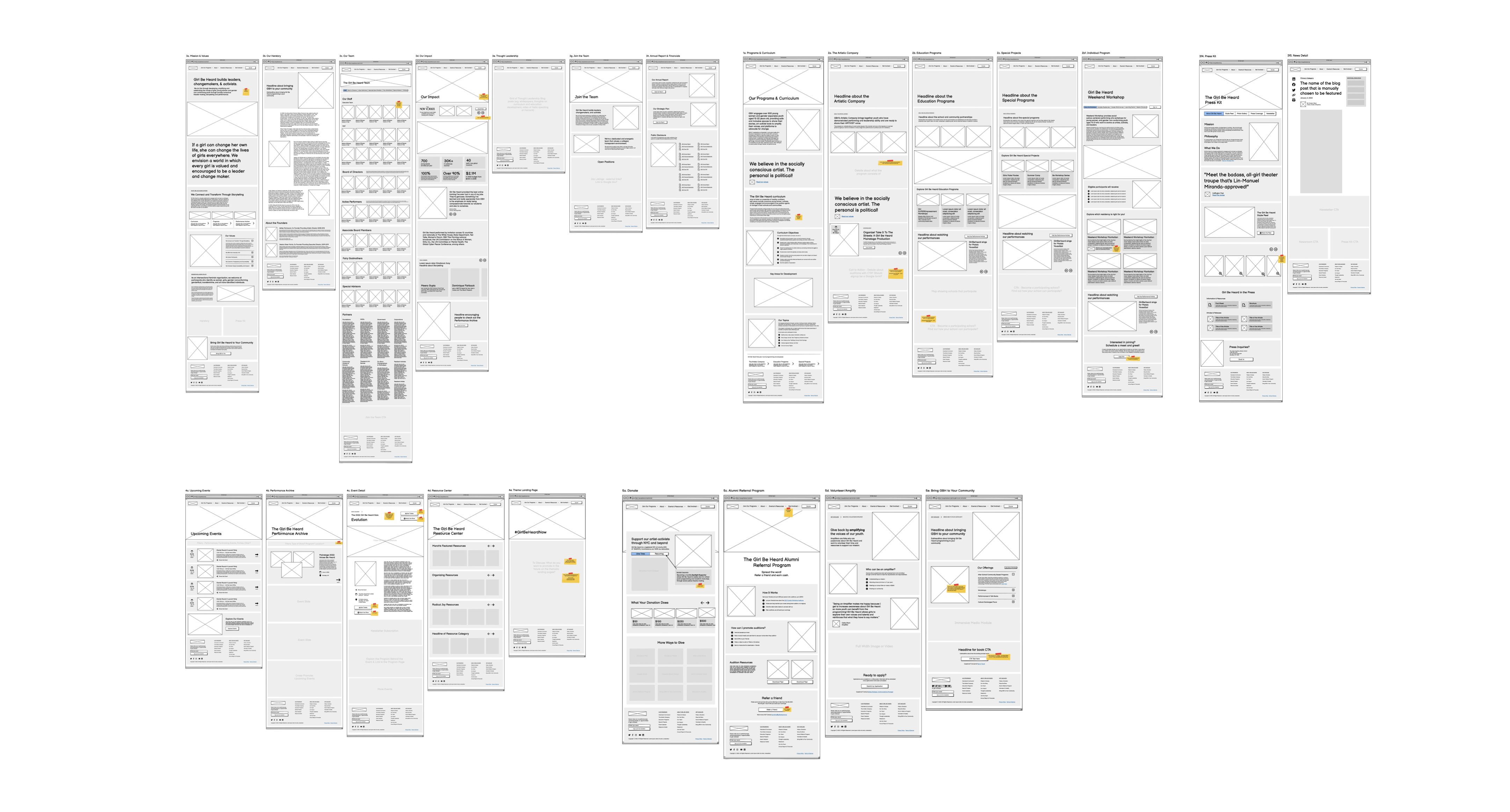
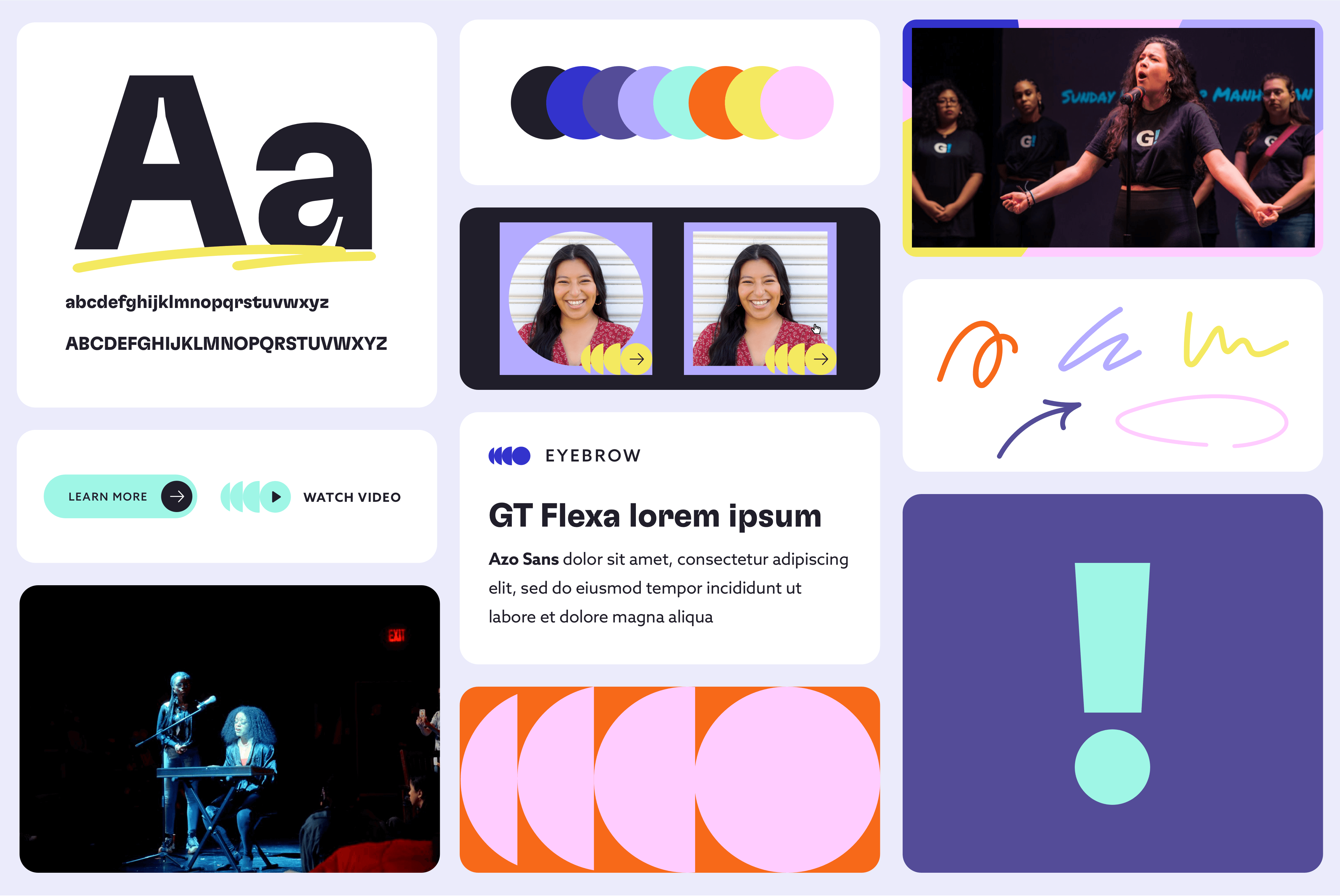
02 Visual Design
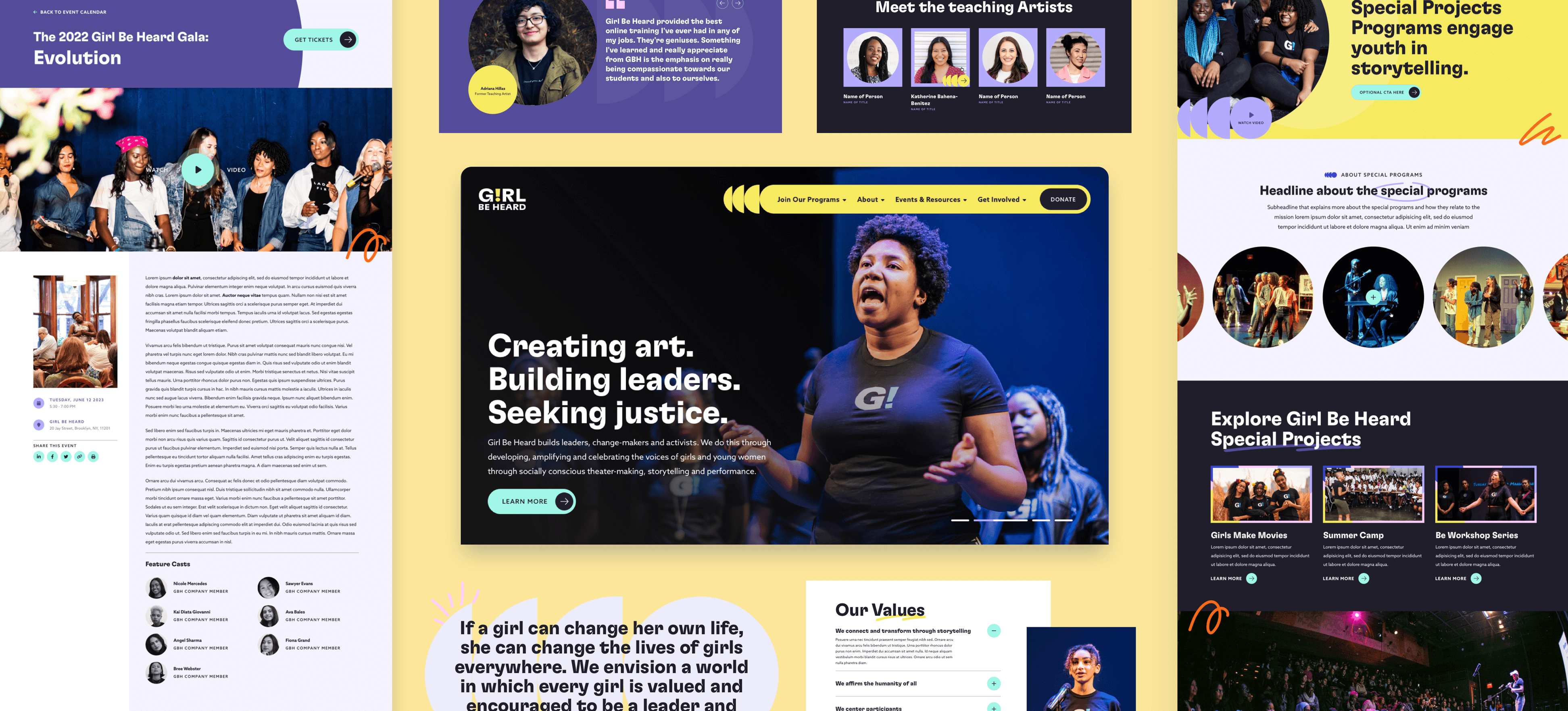
Brand refresh incorporating a font that emobodies GBH's spirit, along with an expanded color palette.
New typeface
Our team chose to uplift Girl Be Heard's identity by adopting the expressive typeface GT Flexa, elevating the brand with a contemporary yet playful touch. The intricate details of this typeface infuse the brand with confidence, modernity, and youthful energy, leading us to refresh the logo using this new typeface.
Colors
By replacing the original blue color with a vibrant rainbow palette, we conveyed a message of empowerment, highlighting the confidence and pride of the girls and gender-expansive youth associated with Girl Be Heard's value.
Concept
Echoing the concept of artist-activism and activist-artist, we incorporated various hand-drawn squiggles with an animated "draw on" effect. This approach vividly communicates the idea of taking action and adds a youthful element to the design.
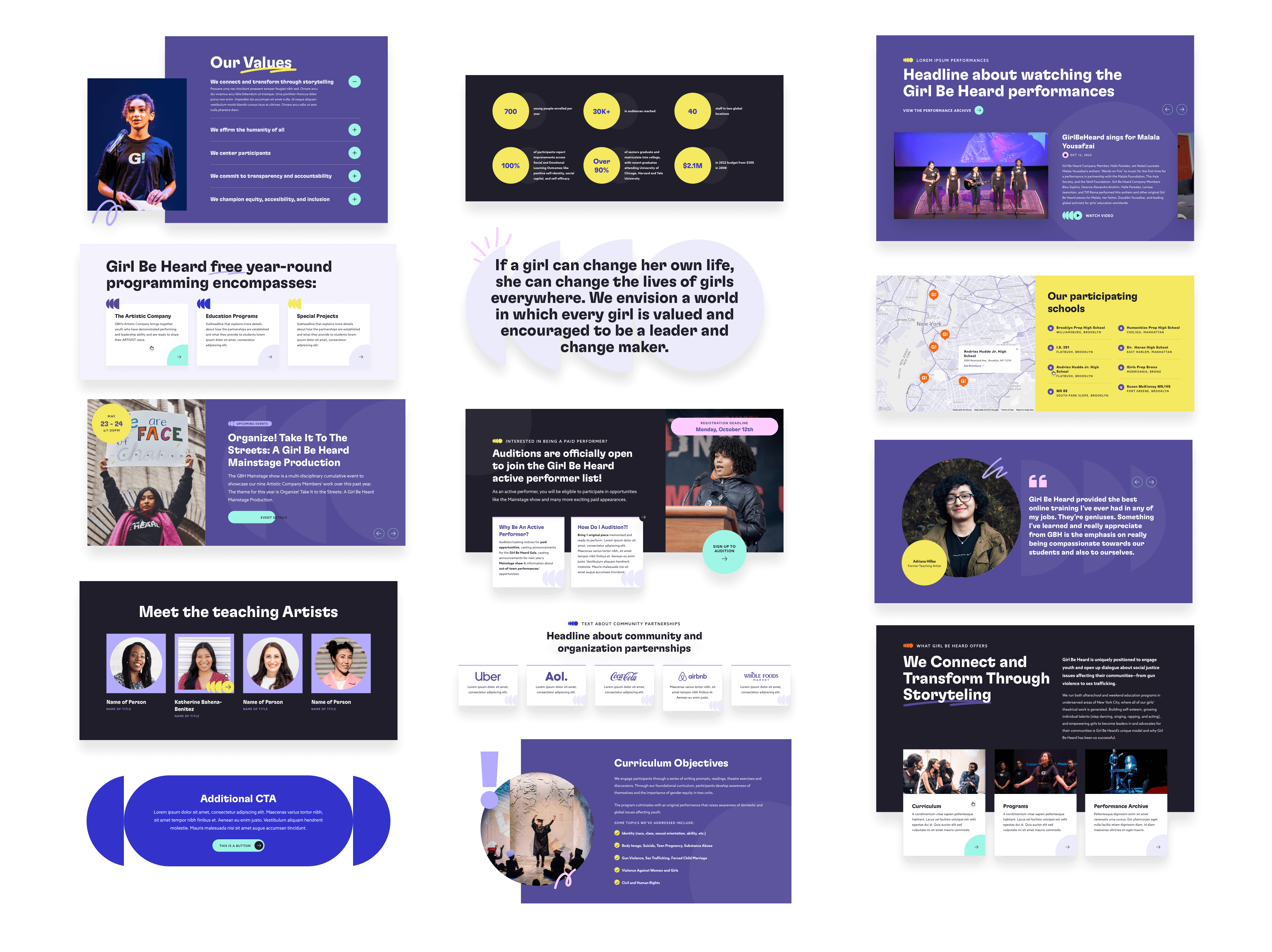
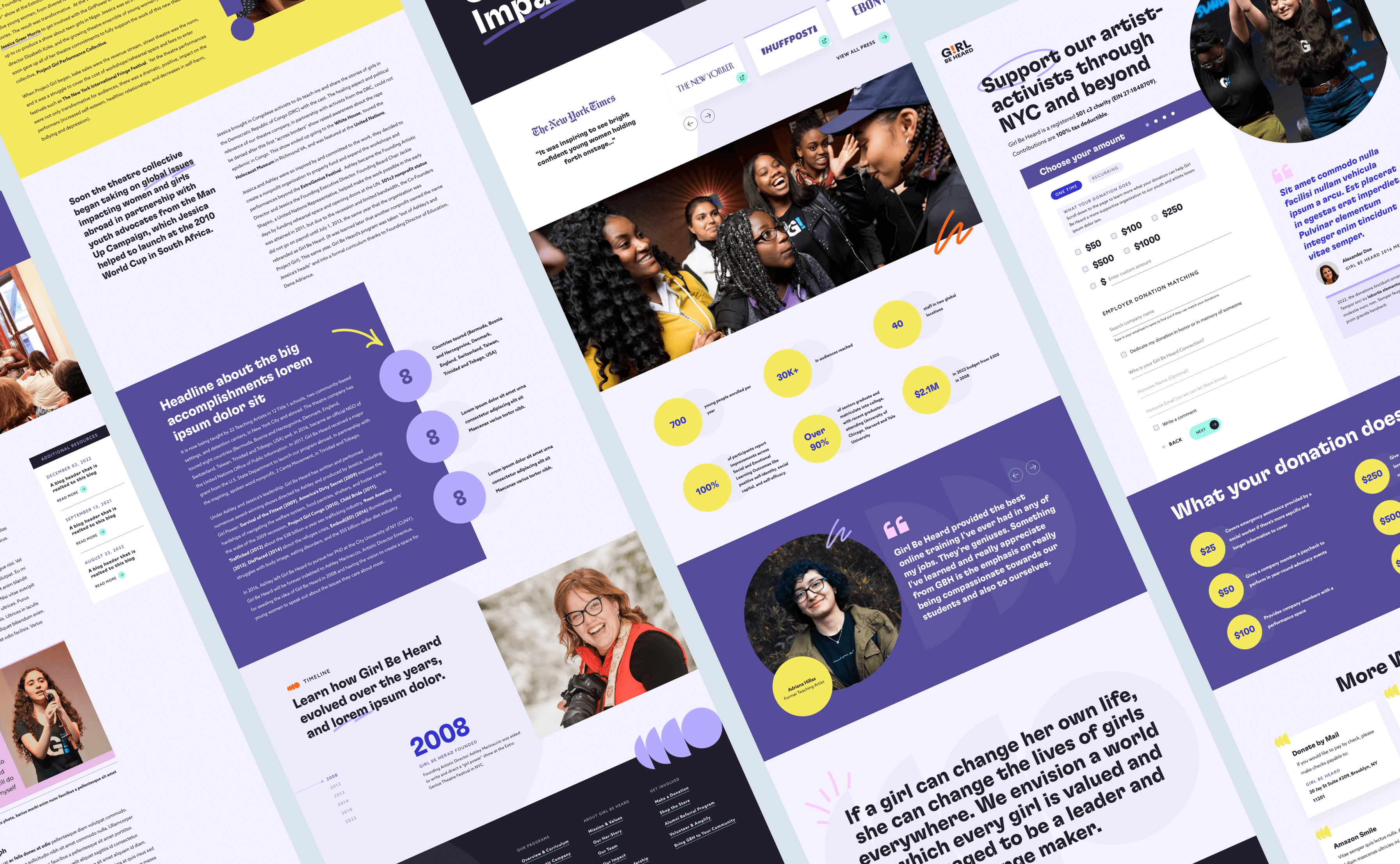
Modular design
Embracing a modular design approach allows GBH team to have the flexibility to create diverse pages, events, and announcements using a variety of modules that can seamlessly interact with each other, complemented by both light and dark mode options.