
Silver Mirror Facial Bar
Reimagining the digital experience for a results-driven facial bar, from brand expression and responsive web design to booking and interactive tools.
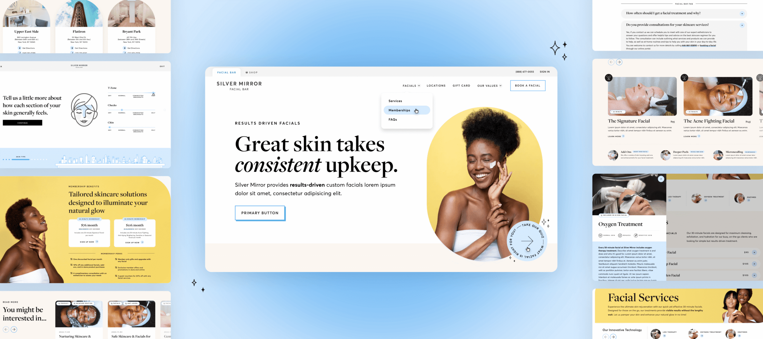
Repositioning the brand through a more elevated digital experience
Silver Mirror makes professional skincare feel approachable, efficient, and results-driven. As the brand grew, its digital experience no longer reflected the polished personality of its physical locations or made its expanding services easy to navigate.
We set out to create a more elevated and cohesive digital experience, while making the path from discovering a treatment to booking one feel effortless.
Role
Lead UI / Visual Designer
Scope
Visual Direction / Responsive Web Design / Booking Experience / Design System / Illustration / Motion
Teams
Lead Visual Designer Me
UX Lead Tamara Olson
Design Director Bruce Viemeister
UI / UX Intern Elaine Shih
Duration
6 months - currently ongoing
View Live Site
01 Understanding the Brand in Context
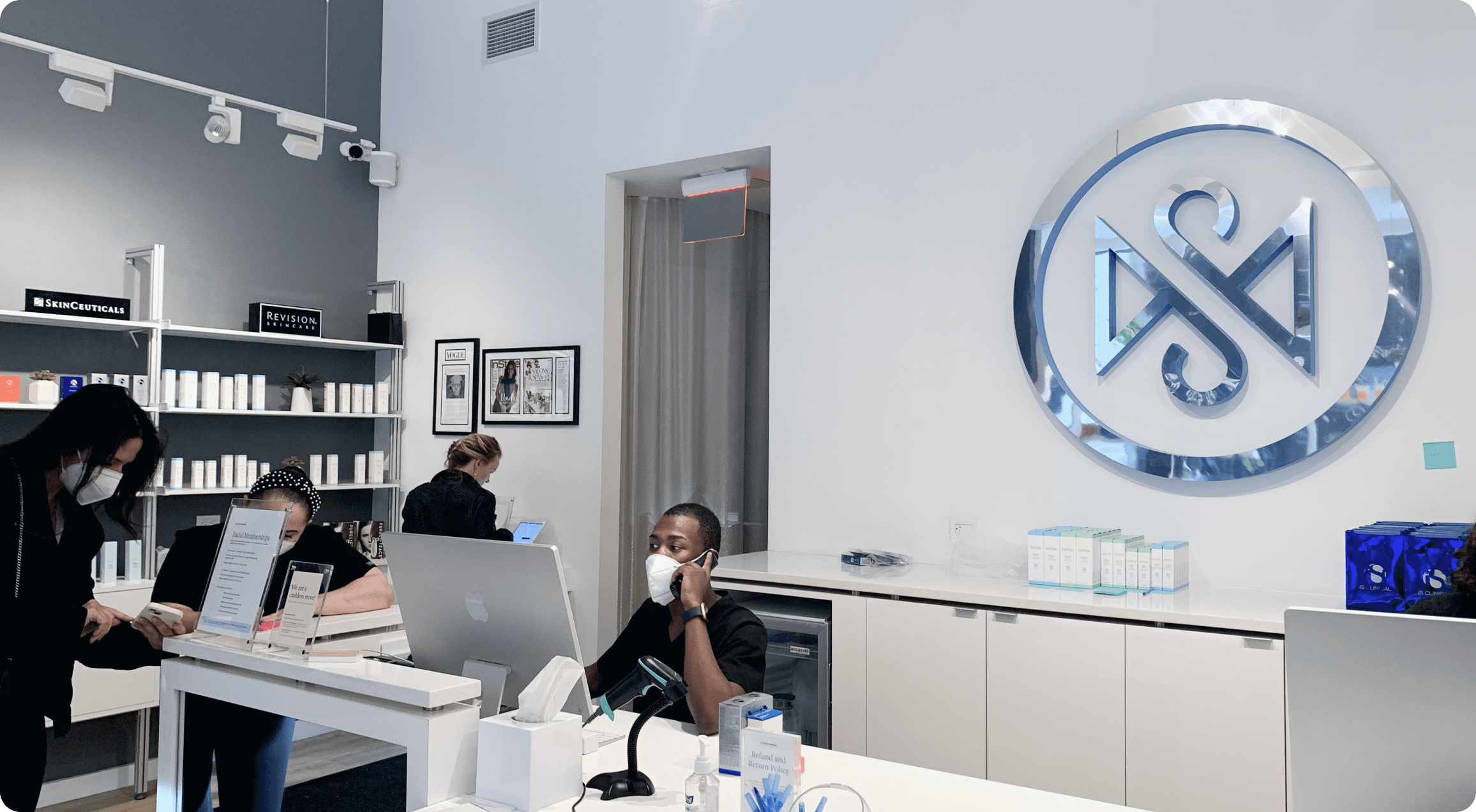
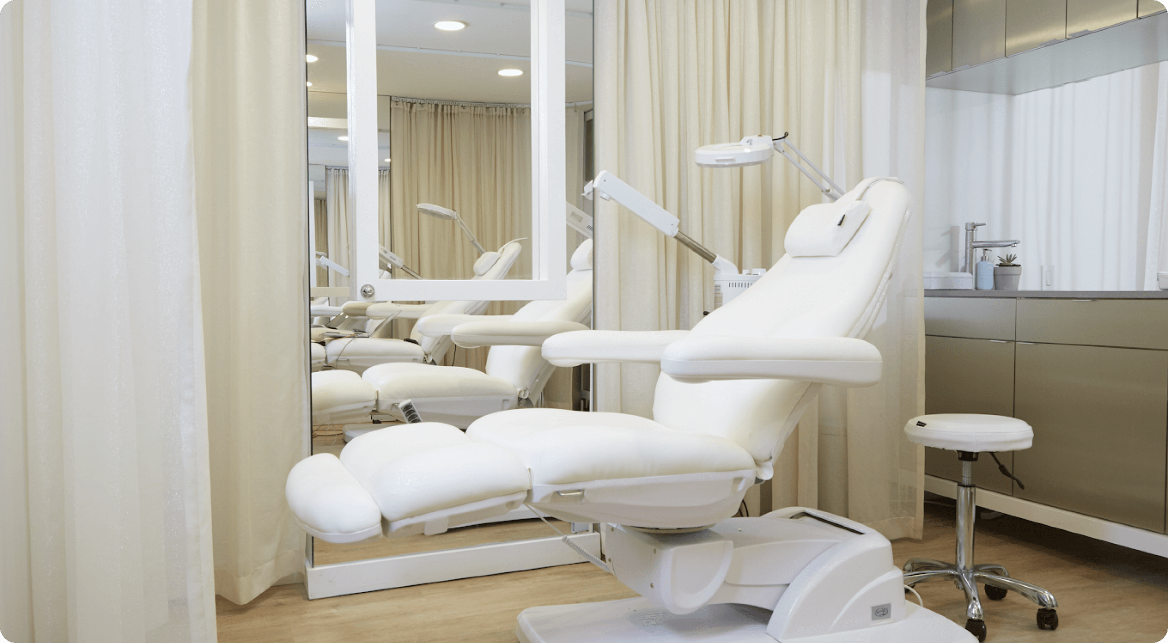
Designing from the physical experience
The physical space felt bright, minimal, and polished, while still retaining Silver Mirror’s playful personality.
The opportunity was to bring that same balance into the digital experience.
02 Early exploration
Visual Audit and Early Visual Exploration
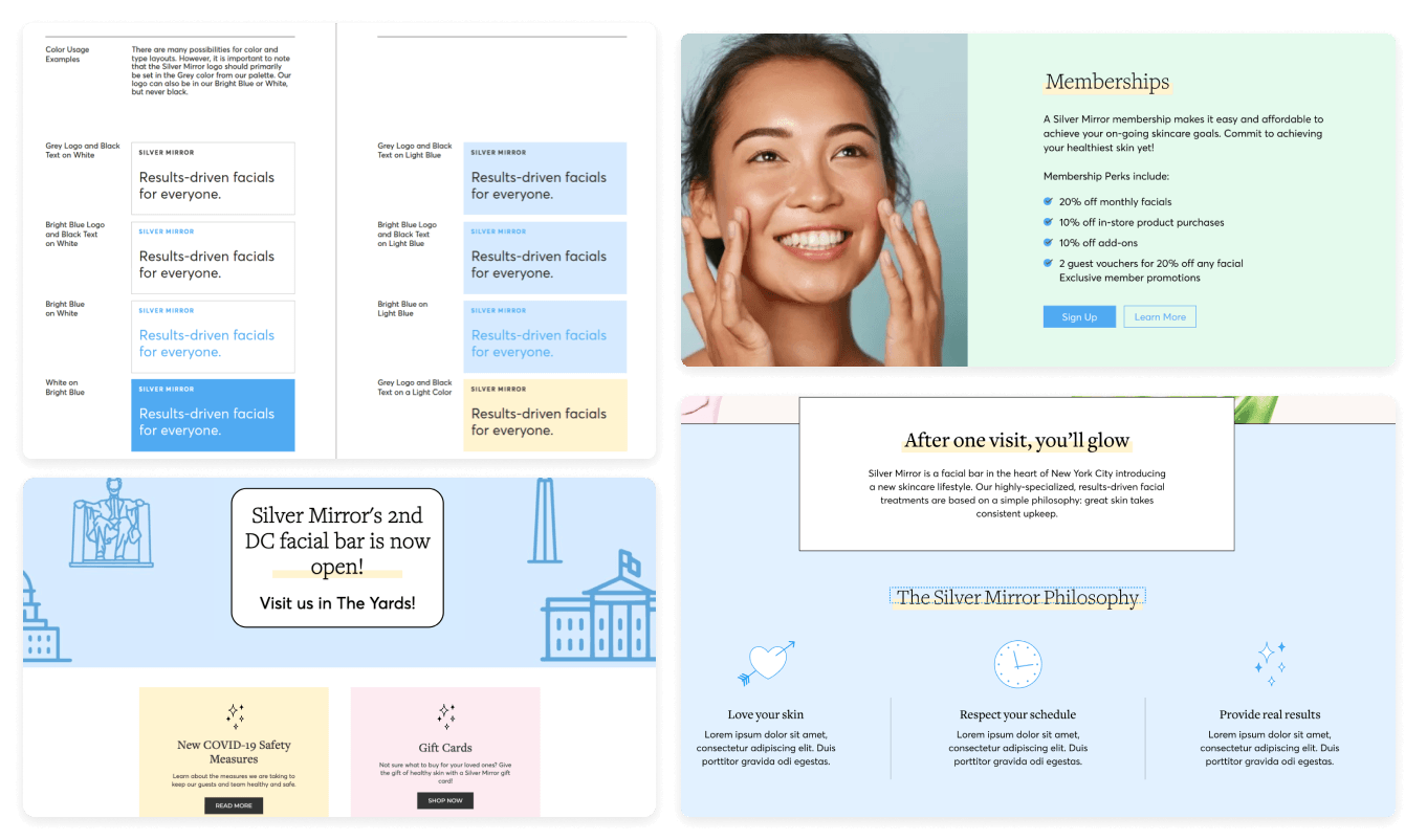
Colors
The pastel palette softened the brand and skewed younger than its intended audience.
Fonts
Limited contrast between type styles made the hierarchy feel less defined.
Accessibility
Several color and type combinations fell short of WCAG AA contrast standards.
Visual System
Inconsistent highlights, line weights, and icon styles made the visual language feel fragmented.
We started looking into their original brand, and found that doing a brand cleanup will be a great foundation for building future pages.
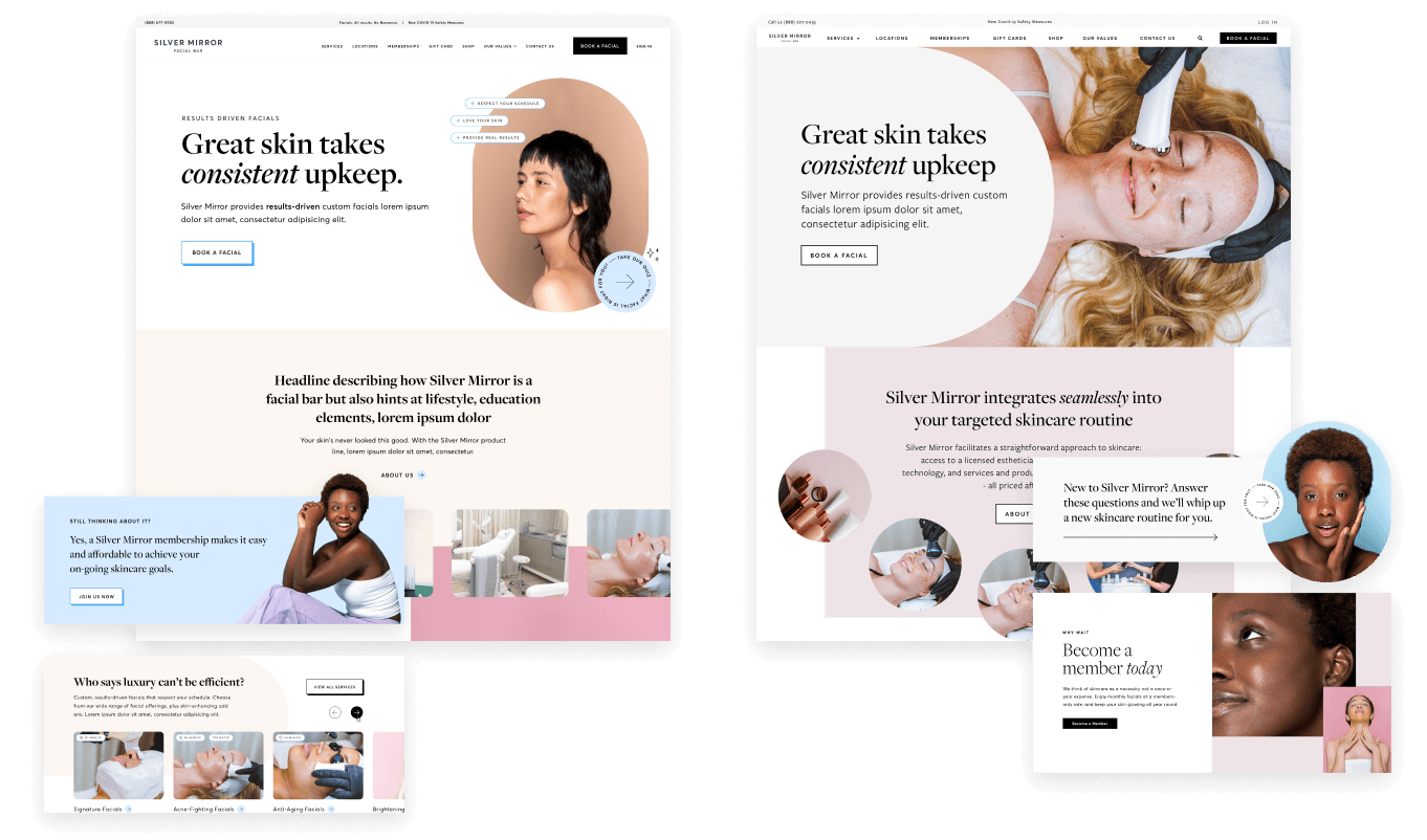
We explored how Silver Mirror’s existing identity could feel more elevated and expressive online by experimenting with typography, color, imagery, and composition while keeping the brand approachable and energetic.
03 Before / After
Evolving the digital expression
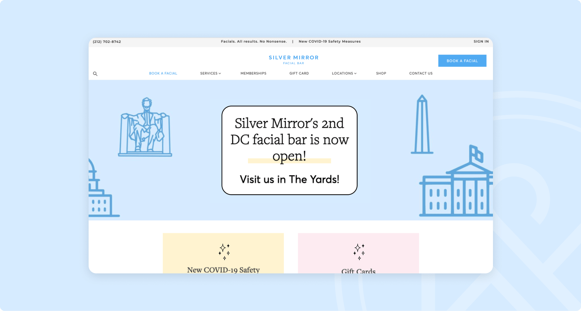
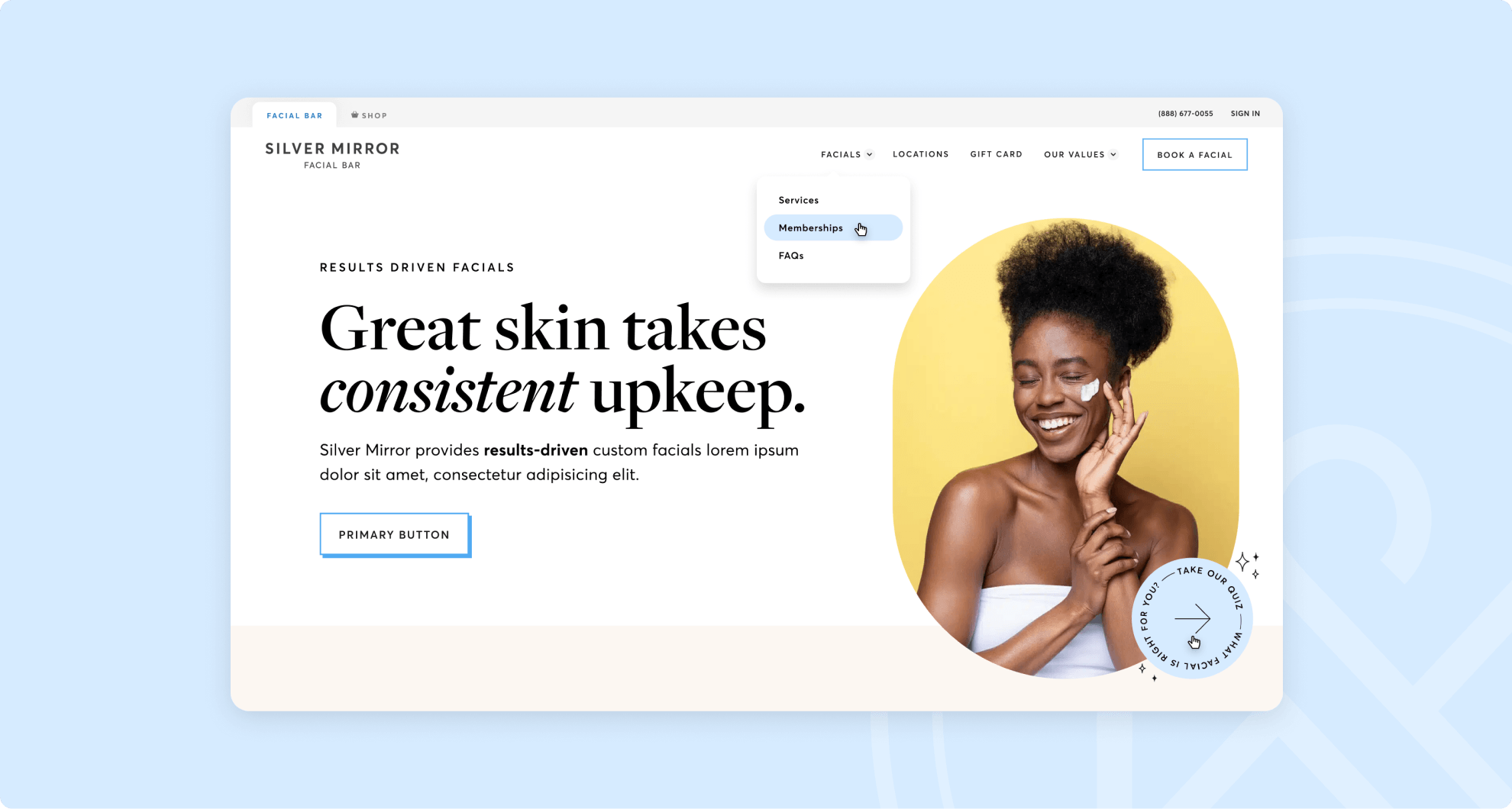
The existing site had plenty of personality, but competing visual elements made the experience feel busier than the physical brand. The redesign kept that energy while introducing more space, stronger hierarchy, and a more intentional visual language.
04 Final Visual direction
Translating the brand to digital
01
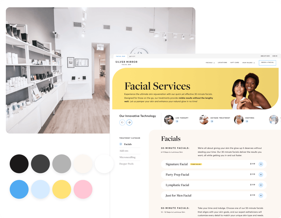
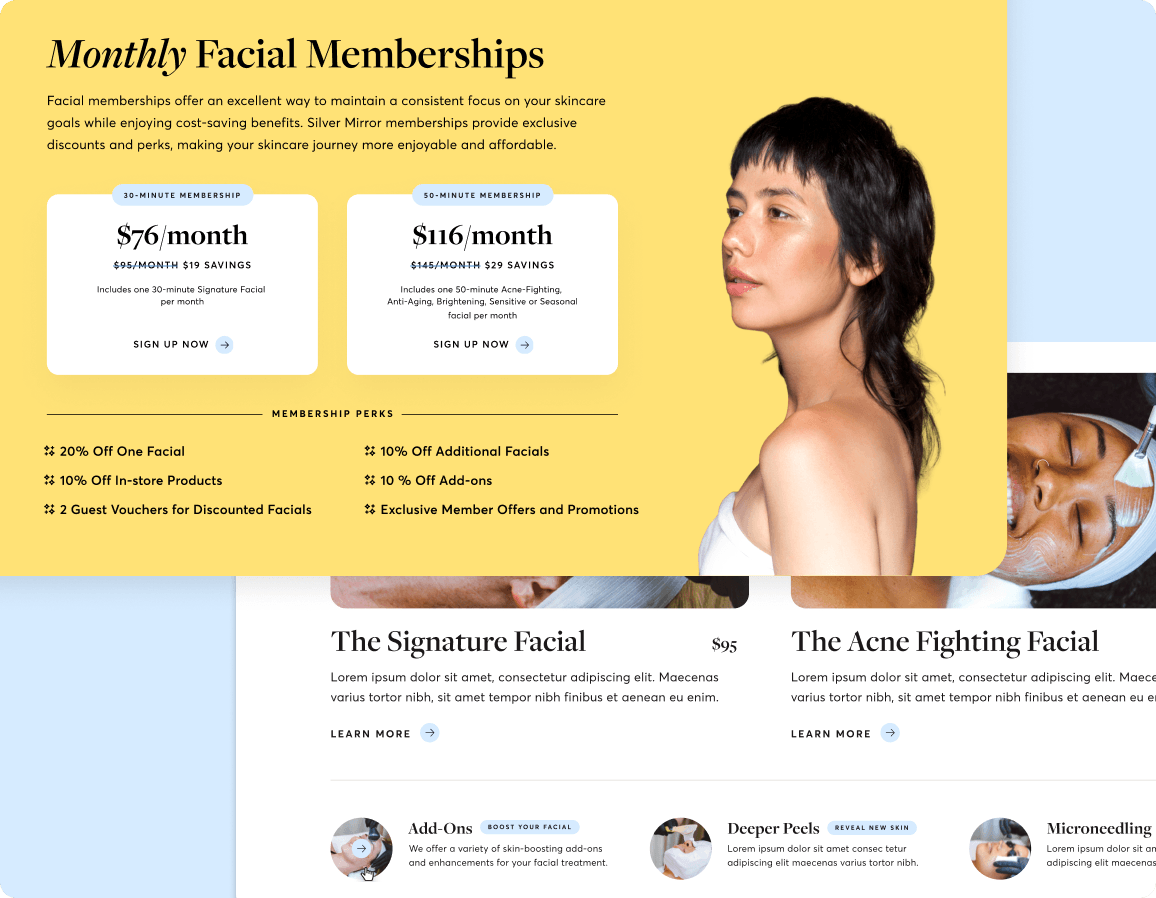
Bringing store-front white space to the website and toning down vibrant colors
After visiting the store, we found out the store is mostly in black and white. Silver Mirror's Art Director, Allis Cheng, has art-directed all our inspiring photoshoots. As the photos themselves are vibrant, I have maintained a limited color palette for the website, exclusively incorporating the primary brand colors.
02
Let the typography do its work
Freight Display introduced a more editorial, elevated voice, while the supporting sans serif kept service information and functional UI clear. The contrast allowed typography to carry more of the brand personality without relying on decorative elements.
03
Creating a more intentional visual language
I simplified the visual language by giving each element a clearer role. Photography became the primary expression of the brand, while color, illustration, and icons were used more selectively to support hierarchy, clarify content, and add personality where it mattered.
05 Design System
Building a system that could scale
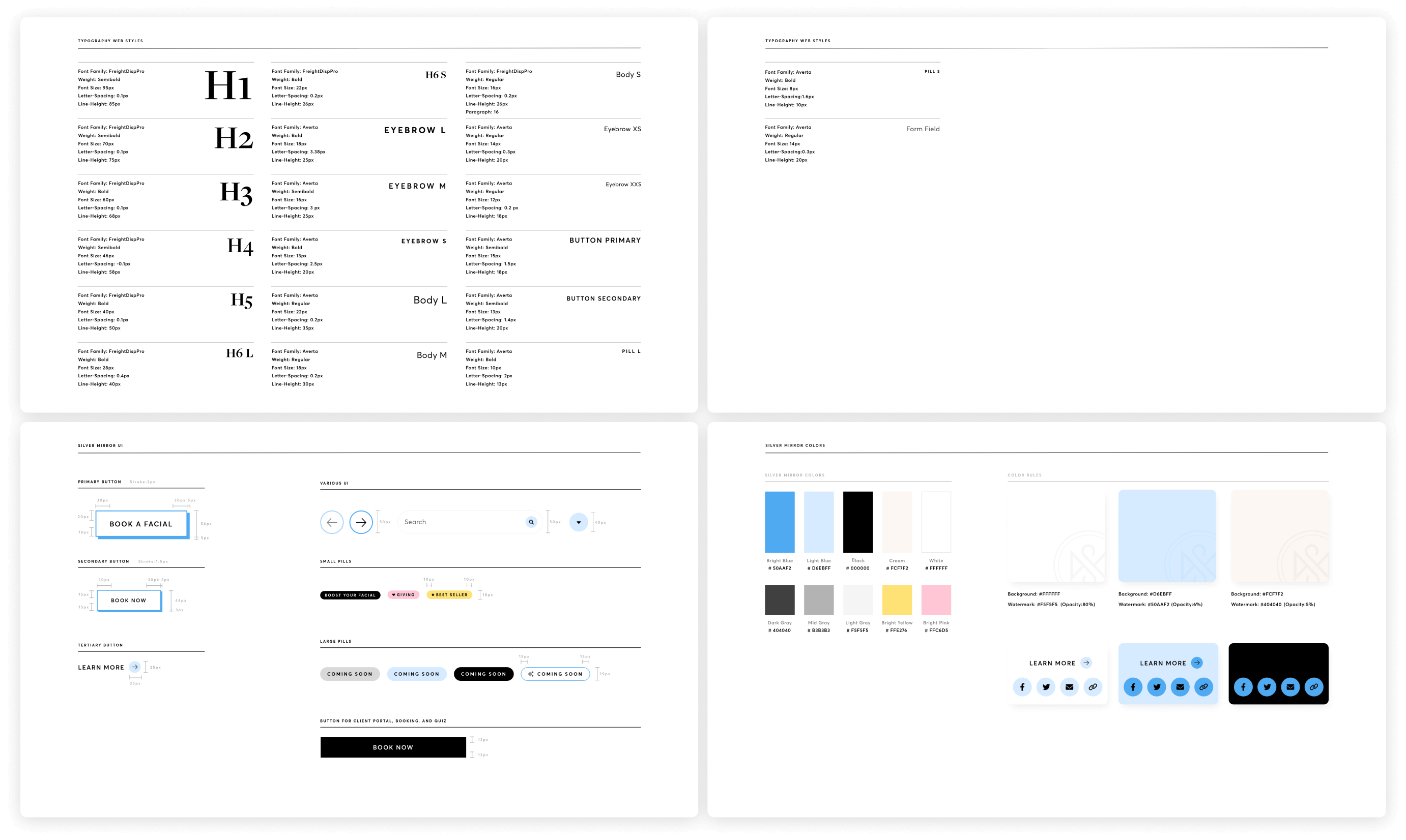
As the experience expanded across marketing pages, booking, and interactive tools, I developed a reusable UI system to keep the brand consistent while giving functional interfaces enough flexibility to do their job.
06 Marketing Website
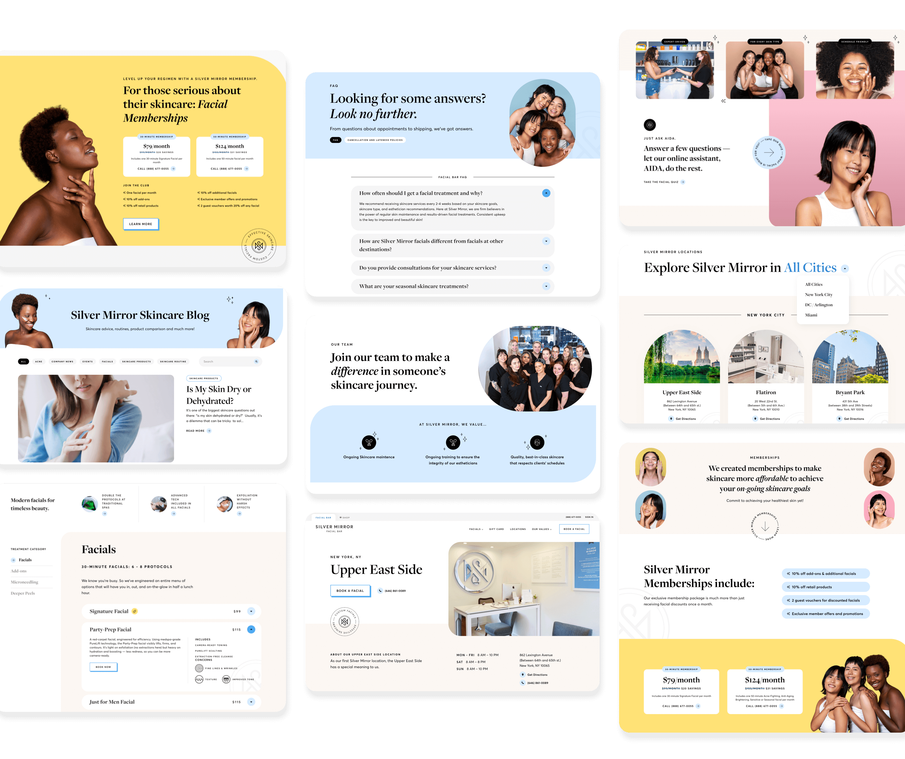
Bringing the system to life
07 Booking Experience
Making booking feel as polished as the brand
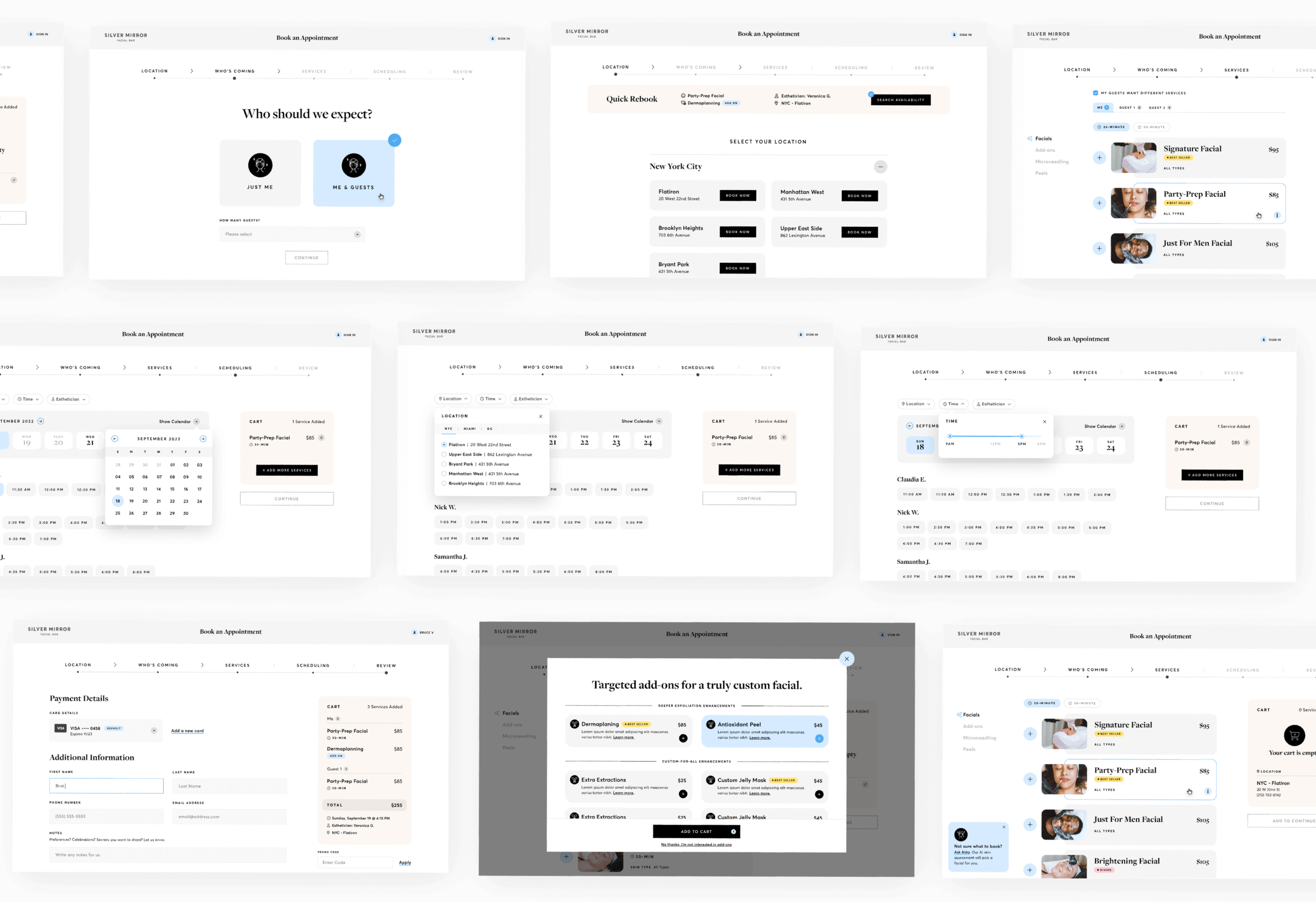
The existing booking flow made it difficult to understand services, compare availability, and keep track of selections.
Working with our UX lead, I translated the revised flow into a visual system that made each step easier to scan, understand, and navigate.
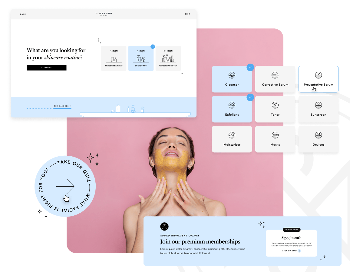
The facial quiz needed to guide customers toward the right treatment while bringing more personality into the experience. A virtual vanity gradually clears as users progress, turning a functional interaction into a playful visual story.
09 Responsive website
Designed to adapt
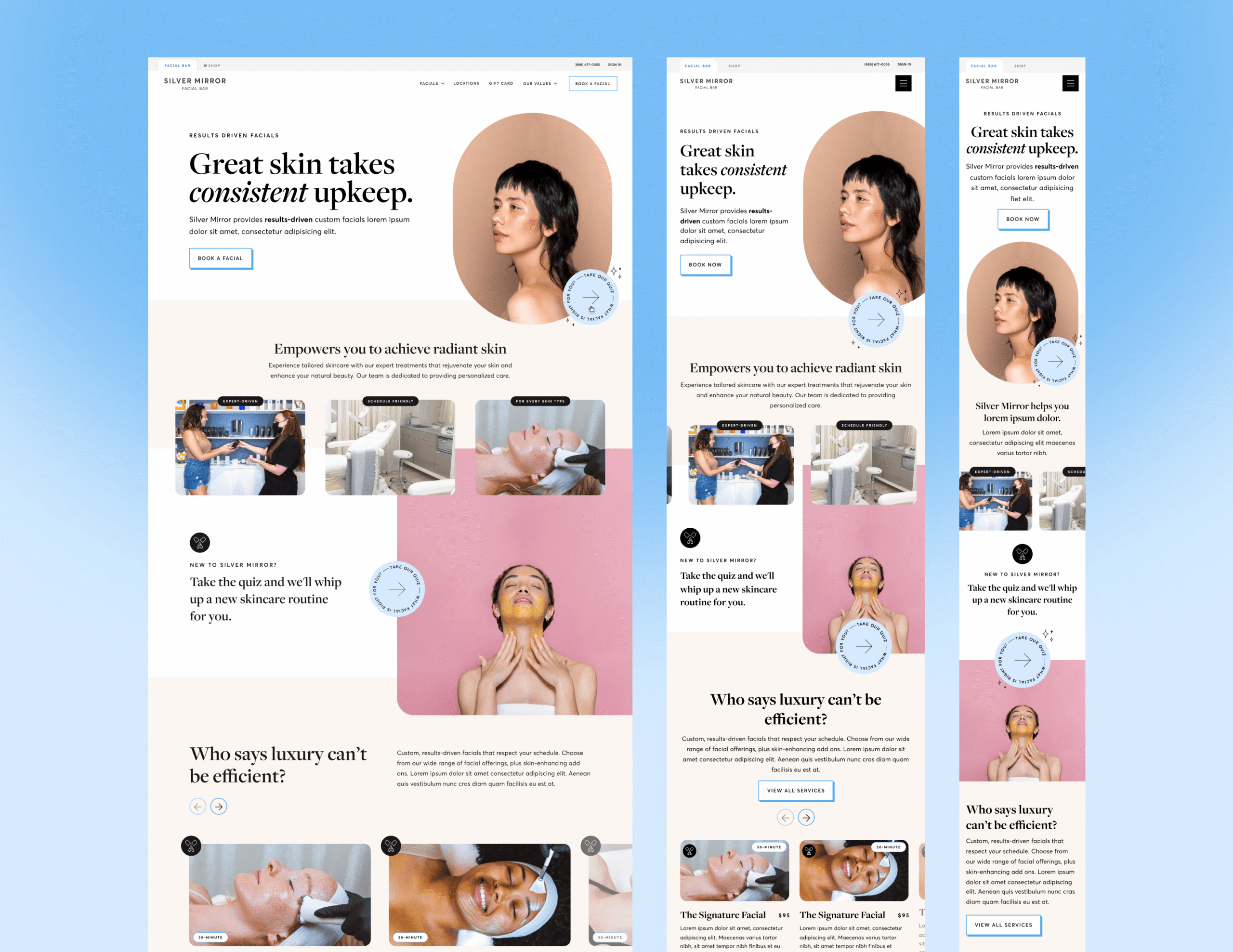
The visual system was designed to retain its editorial character across screen sizes, adapting typography, image composition, spacing, and content hierarchy rather than simply stacking desktop layouts on mobile.
10 Working with the developers
From Figma to launch
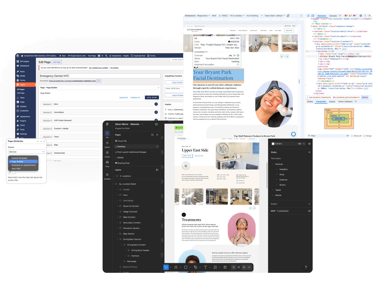
My role continued beyond final comps. I worked closely with developers throughout implementation, reviewing responsive behavior, interaction details, spacing, typography, and content to make sure the final experience stayed true to the design.
Imapct
The redesign established a more cohesive digital direction for Silver Mirror across its marketing site, booking experience, and interactive tools. The visual system gave our team a shared foundation to build from as the experience expanded, while my involvement through implementation helped carry that level of polish into the launched site.